Improving Reporting
Lobster Ink (Ecolab), 2020
Problem
Several users were expressing their difficulty using our new reporting experience - difficulty with finding the right reports, difficulty understanding how it works. Reporting had not been built in collaboration with user feedback which meant that there was great opportunity for improvement. The PO approached the UX team with a question: How can we make Reporting more user friendly?
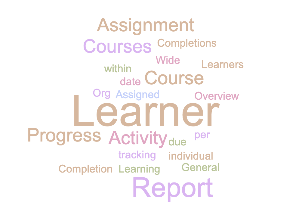
An example word cloud for one report.

A table demonstrating which reports had the strongest associations for participants.

Approach
User Testing
I advocated for a research-first approach and began by running two user studies (5 participants for both), each focused on the main tasks of our reporting users. The results of the two user studies revealed that Reporting had usability issues when it came to findability. Two things were clear: navigation and how we organize information needed a rehaul, and how we named reports needed improving.
Information Architecture Research
As a next step I organized a remote study with 9 participants inspired by card sorting for the purpose of understanding the mental models of users and if there were mental associations users had between different reports. This would inform how we could organize and group our reports. For this remote, moderated study, I used Google Slides to facilitate the activity and asked participants to manipulate and edit the deck.
Grouping results
In order to analyse how participants grouped reports, I viewed each participant’s groups and awarded each pair of reports 1 point if they appeared in a general group together, and 2 points if they appeared in a subgroup together. After adding up the scores for each pair from each participant’s grouping, I was left with a table of total association points. To further my analysis, I adapted the Jaccard Coefficient/Similarity Index to identify which reports had the strongest associations (pictured right).
Next, I put the strongest unique pairings into their own separate groups and began to sort the remaining pairs into those groups. I worked from strongest association pairs, to weakest. If a pair contained a report that was already in a group, that pair would be placed into that group. I then deleted the duplicate report titles in each group.
Below, you’ll see my final grouping results both with the original name of the reports, as well as my own title recommendations I had applied using the word clouds from earlier. Of course, the titles are not final, but they provide insight into how these reports can be more intuitively named. In addition, I recommended removing some redundancies.
I presented my findings to the team. As a next step, a collaboration with the team’s data engineer began to quantitatively determine the business value/need to make improvements (this is necessary due to limited resources available for the team). Ideally, we will apply the recommended changes after determining appropriate titles for the reports and measure how user behaviours change, if our support tickets on this topic decrease, and potentially even run an A/B test to measure the differences between the current and proposed versions.
The proposed groupings.
Here’s how it went:
Participants were asked to review a screenshot of each report (title removed) and to create a title for that report using words that made the most sense to them. This would help the reporting team understand if there were more intuitive and user-friendly titles we could apply to our reports.
Participants were then provided with a slide of all the titles they created and asked to groups those title in a way that made the most sense to them - demonstrating the mental associations titles had with one another. These categories were given names by the participant. If they created several groups, participants were then asked to group them into larger groups (and give those larger groups names). If they had only create 2 or 3 larger groups, participants were asked to create sub groups within those larger groups (and provide names for those subgroups).
Naming results
When it came to naming reports, I found that there were some patterns to note. However, given that these patterns were drawn from only 9 participants, there was no statistical significance present. Therefore, I created word clouds for each report using the names provided by each participant. These word clouds offered inspiration on the human-friendly words we could apply to our reports. I recommended that further workshopping of these titles as a next step follow by further user validation.