Verifying physician histories
RL Solutions, 2018
Business Problem
Claims departments receive a substantial amount of requests from physicians in their captive to confirm any lawsuits they were named in and the lawsuit amount. One person is typically responsible for responding to these requests and can spend up to 6 hours a day verifying claims using the RL system. How can we surface the information users need without requiring them to spend this amount of time digging through files in the software?
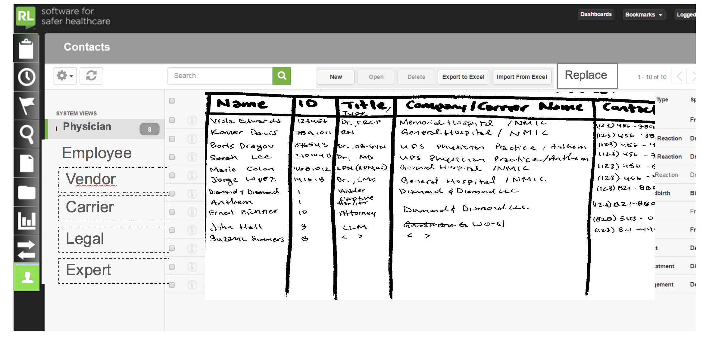
The initial designs by the Product Manager to communicate the idea (before design and research).
Workshop artifacts
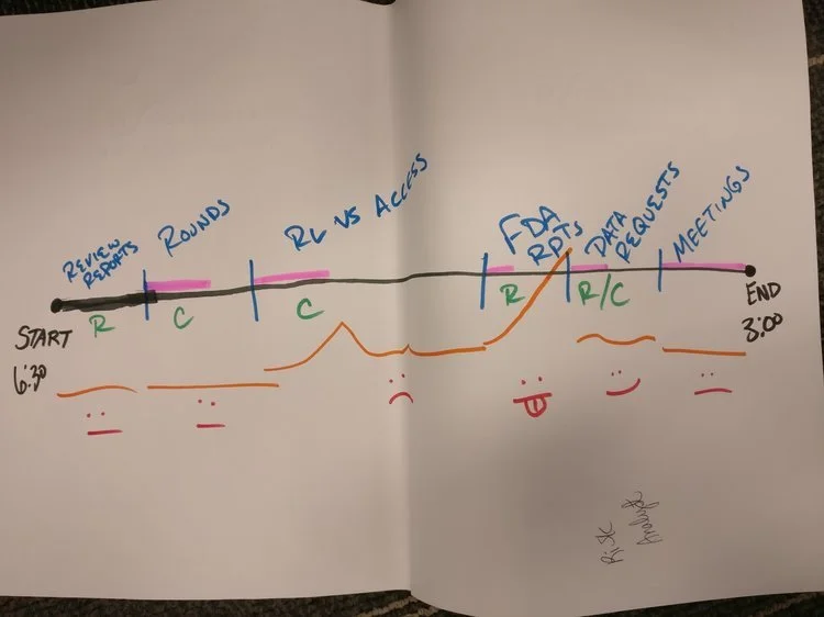
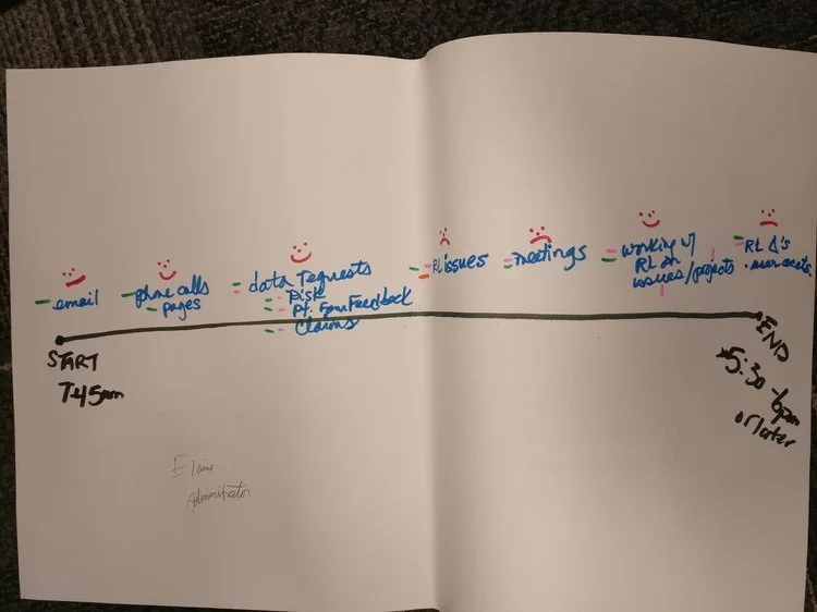
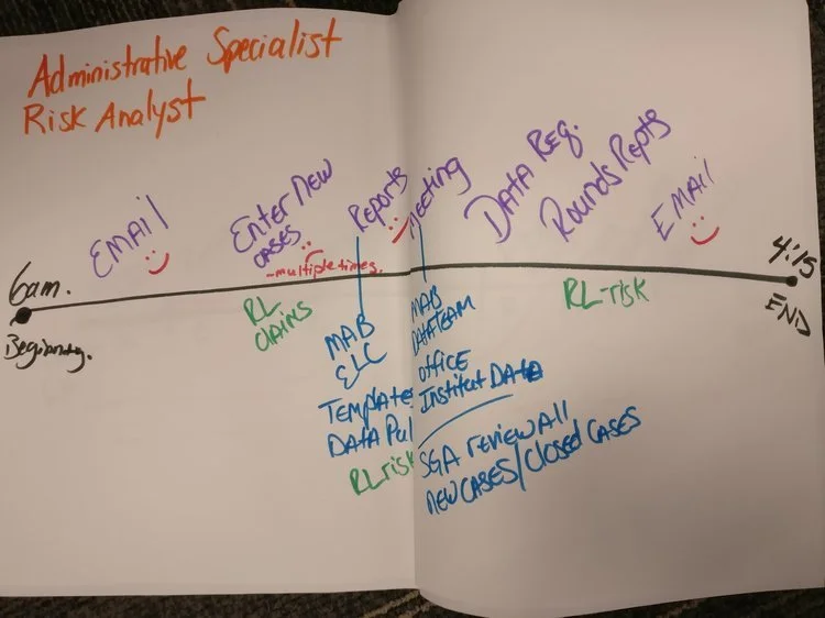
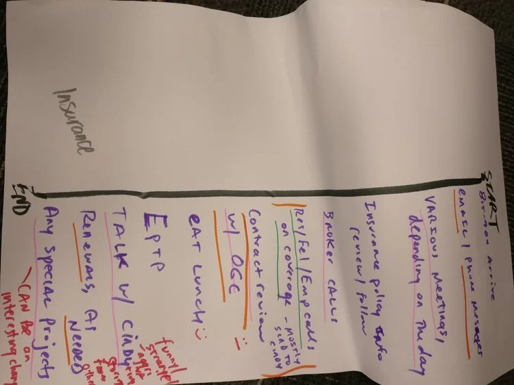
The below are day-in-the-life timelines
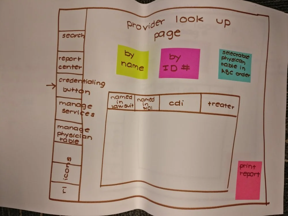
Another design by the Product Manager (before design and research).
Approach
The Product Manager came to me with an idea she had to reduce the amount of time required to verify a physician’s claims. I began by understanding how she arrived at her proposed solution and gaining a better understanding of what she had learnt about the users who fall into our Claim Persona.
After learning that she had not spoken with actual users who were doing this verification work, I jumped on the phone and began interviewing. I wanted to hear from the individuals doing this work daily so that I could wrap my head around how their day was impacted by this verification task. I was able to confirm the PM’s initial learning, but I wanted to take it a step further.
I arranged two on-site visits with clients. One client was in a large urban centre and had a joint insurance and claims department that also employed lawyers. The other client had a small claims department for a university hospital in a mid-sized town. I spoke with 5 end users at each location and watched as they performed a claims verification or went about their typical day-to-day work (some used the product for other purposes than verifications). Visiting these two clients provided me with a more contextual understanding of the problem. Despite the cultural differences between these two clients, and the difference in background the users had, there was a clear pattern in how our product would be able to surface the correct information for a physician’s verification while reducing the time it would take to do so.
During the visits, I had each participant walk me through their day by drawing a timeline on a tabloid-sized paper. I had them write in one colour when they arrived, had breaks, and left in a typical day. In another colour, they wrote when they worked independently. Another colour for when they collaborated with others, another for when they used our software, another for other tools they used, and then emoticons to describe how they felt at each part in their day.
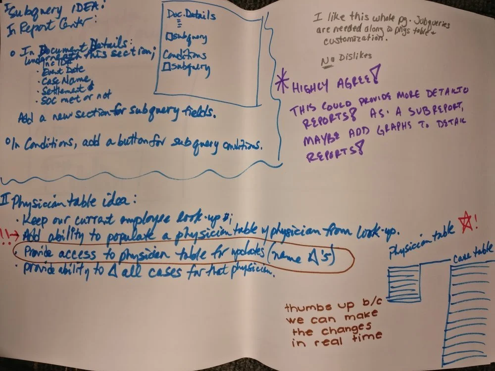
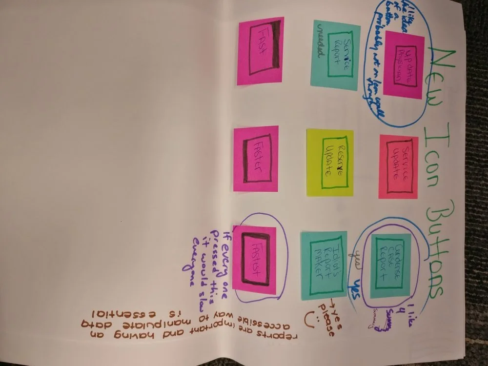
Since I had extra time with the university hospital claims department, I decided to lead a co-design workshop with their users. While some users were more familiar with verifications than others, everyone was encouraged to share their ideal experience of verifying a physician’s claims history. Each person was provided with a large piece of paper divided into eight rectangles. Each square represented a different idea of how we could make their experience better. Everyone shared their ideas, then passed the papers around and used markers to make improvements on colleague’s ideas and draw happy faces next to ideas they liked. From this workshop, I was able to see what the participants of the co-design were most concerned with and which small problems they were most keen on solving.
Below are examples of the co-design activity.

A task flow based on the findings from the research.
Results
I used the finding from the visits to make several recommendations on what should be included in an experience. I created a task flow to demonstrate how a user went about the verification process and another task flow to demonstrate the ideal experience. I also defined which pieces of information were most important for a claims verification to be completed and any second-level information that would be a nice-to-have.
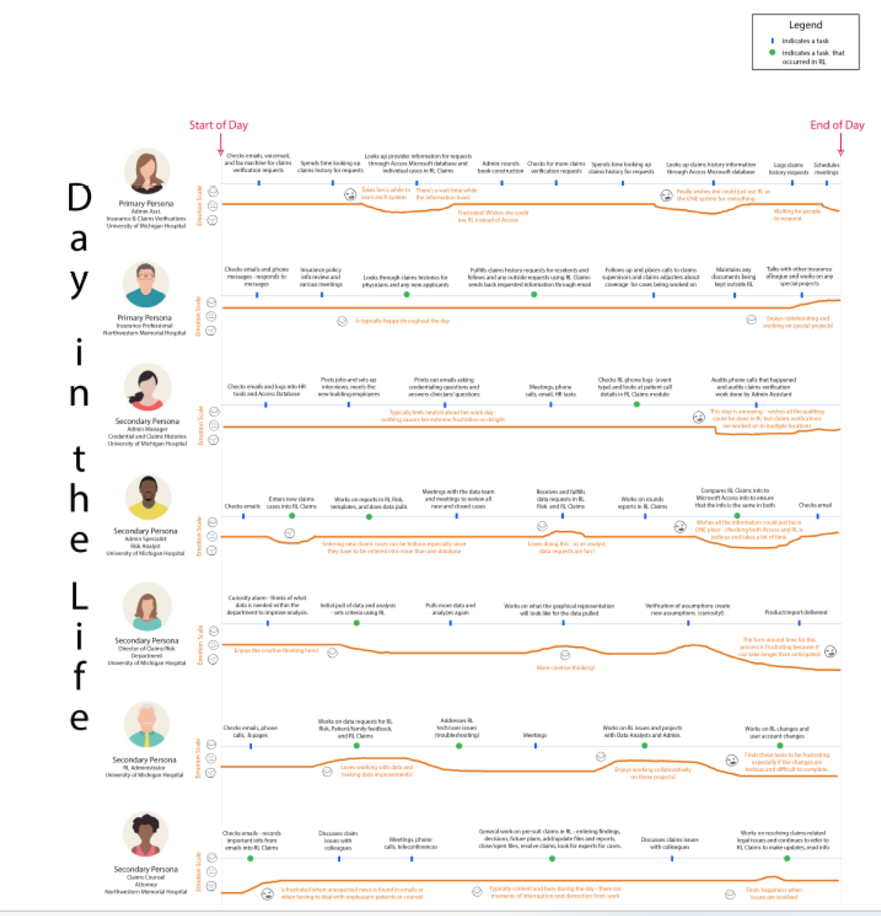
The consolidated Day-in-the-Life map showcasing the learnings from the Da-in-the-Life activity completed with participants. This map breaks the maps down by user personas.
From there, I worked with the UX Designer to help her understand the users’ mindset and wants. After the initial wireframes, I ran a remote concept test with 5 users who I had not yet spoken with for this project. I presented my findings and recommendations to the UX Designer and PM which resulted in a low-fidelity design. I remote tested the low fidelity designs with the clients who I had visited in-person to ensure that we were continuing to meet the needs of those who we were designing for. Although there were a few minor improvements to be made, the designs were ready to be passed along to development.
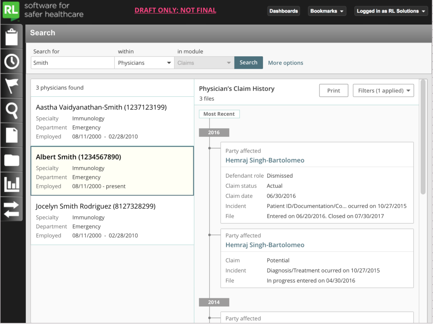
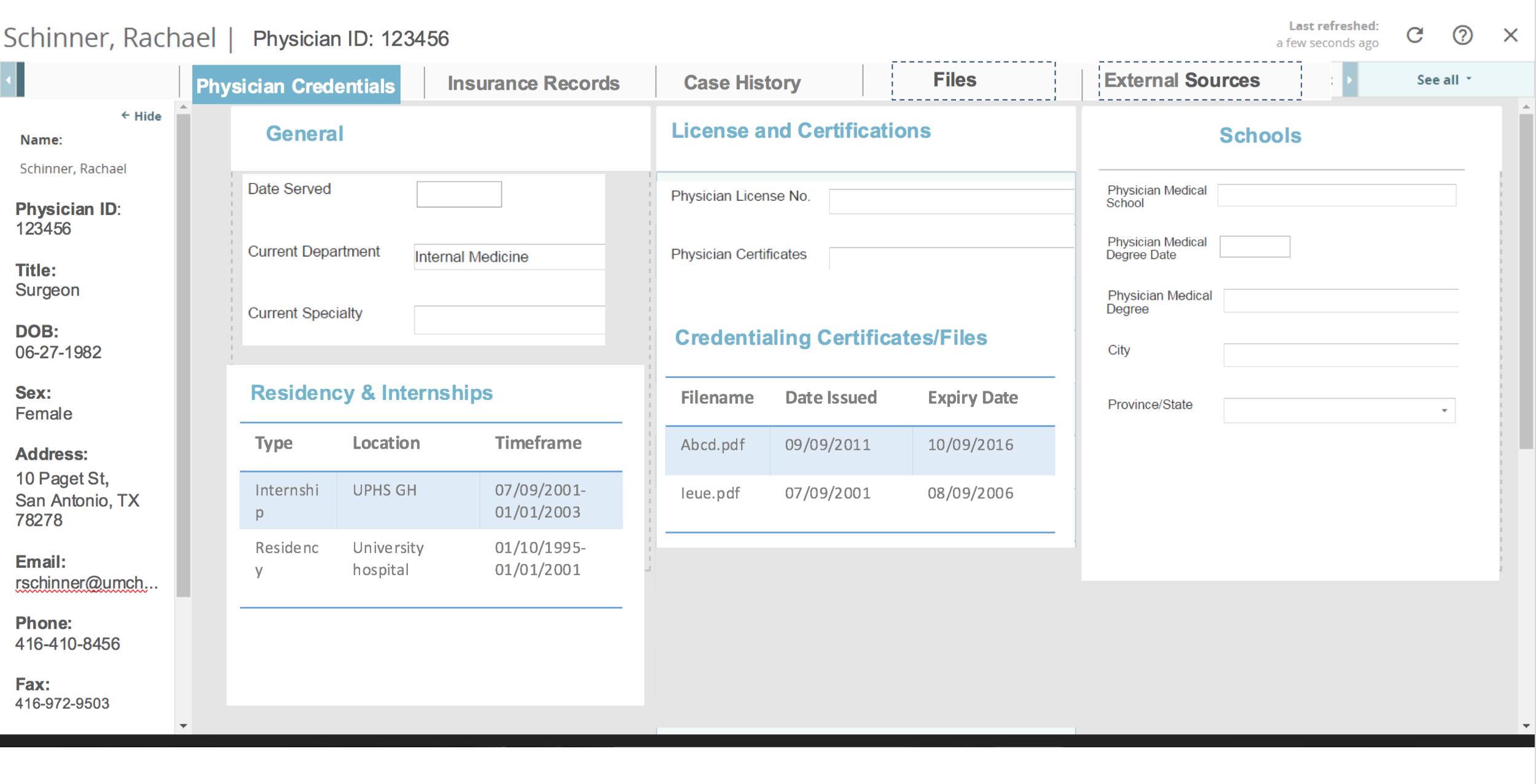
The final design by our UX designer, Jaquelyn Monis Rodriquez.